Friday, 8 March 2013

Music Photography - Album cover

Today we were given the task to create an album cover. We could either re-create an existing one or just make up our own. I chose to make up my own.
 
I used Laurence as my 'artist' and one of John's guitars.
 
The 'band' is called 'Laurence and the Machine'...... get it??
 
Here are some of the shots...


I ended up with 2 album covers...


For this one I used a texture I took on my camera yesterday of some bark off a tree.


After this.... the class worked together and re-created a Jackon 5 album cover!


Thursday, 7 March 2013

Textured Montage

Today I experimented with textured montages. I took some portraits and then went out took some pictures of various textures that I could find.
 
I took a portrait of K in the studio and then used photoshop to layer the textures onto the image, making sure all of the images that I was putting together were the same resolution.

I started with this image of K...


I started with this texture of some wood.

 
I dragged the texture onto the picture of K whilst holding the shift key so that it lined up the 2 images correctly. Then I put the blending opacity to about 55%. Then I created a layer mask and uncovered K's face of the texture, using and opacity of 100%.

 
Next, I used this texture of graffiti on a wall.


I did the same with this layer, making sure his face was clear of the texture. However, when going over his hat and coat, I used a lower opacity so that some of the texture was showing. I played around with the blending modes to see what looked best.

 
With this texture of a grid cover, I used the gradient tool so that it was only showing on one part of the image. I created a layer mask then clicked on the gradient tool and chose the black to white option. Then I dragged the cursor from one side of the image to the other which made the grid show on only one side. I set the opacity to about 50% again and then created another layer mask on this layer to uncover his face of the grid texture.


This is the end result. As you can see, I added another little image of K in the bottom corner.


I did the same again with an image of Besma and some different textures.


 Ii changed it all to black and white as I thought it looked better.


Saturday, 2 March 2013

Music Photography - Song - Dig

I missed yesterday's session with Richard due to being poorly but I knew the plan was to do some music photography so I was quite gutted I couldn't go in as I LOVE music and obviously quite like photography too.....
 
After asking Andy what they got upto yesterday, I found out that the class were set the task to think of a favourite song and create an image or a set of images to interpret that song.
 
I thought I'd get on it straight away because I thought of an idea to be shot outside and the weather is lovely today so I thought I'd take advantage of the light. I also used my 5 in 1 reflector for extra light where I wanted it.
 
I chose a song by one of my favourite bands, Incubus. The song is called Dig. My take on this song is that it is about true friendship in a relationship and how people can help each other through the crap that can happen in life. There is someone special in your life whether it be a friend, partner or family member that can bring out the best in you.
 
I'm not usually a soppy person but this song really tugs on the old heart strings!!
 
 
I chose to photograph some roses. I had some old dead roses left over from Valentines day (wit wooo) and also some fresh roses that my Dad had recently bought for my Mum (awww).
 
I chose roses to symbolise the love aspect of the song. The dead roses represent how you're not always at your best and everyone has imperfections. The soil covering the dead roses represent that rubbish in life that we all go through from time to time, weighing us down. I chose 2 fresh roses to place on top of all this, to represent a partnership and to show that people can 'Dig' each other out of it all and bring out the best in each other. I finished by using a texture with the image and then put a lyric from the song over the top. This reads 'If I turn into another, dig me up from under what is covering the better part of me'.


This is the texture I used with the original image. Whilst I was outside, I was looking around my garden for a suitable texture. I took a few but this one suited the best. It is a close up of an outdoor chiminea we have. It worked well because it looks quite like dirt and soil when put together with my image. I created a layer mask and only revealed the texture around the fresh roses in the middle, leaving them clear.


Anyway, give the song a listen and the video a watch.......makes me want to cry abit!


p.s. Here is me with the lead singer of Incubus. Ahhhh!!! Best day ever!


Friday, 1 March 2013

Wide Angle

John set us the task go out and take some pictures using a wide angle lens from viewpoints that aren't eye level, in order to create a distorted image of the subject.


This one was taken very closely to the tree looking up the trunk. I used my 18-55mm kit lens at 18mm. As you can see, the tree appears distorted. The foreground looks a lot larger than the background. Using a wide angle, really exaggerates the depth and the height of the tree. This image would appear even more distorted if I was to use a 10mm lens for example.


This is an image of some fungus growing on a tree. Again I got very close and low to the ground. The fungus closest to the lens is exaggerated in size compared to the fungus a little bit further in the background.


Here are some images I have taken using an even wider angle lens. I used a 10-20mm sigma lens which gave more distortion and exaggeration of size.


Tuesday, 26 February 2013

Architectural Photography

 
Architectural photography is the photographing of buildings and man made structures.
 
In small groups we discussed what we associate architecture with and this is what my group came up with........ 


Here are a few images I took in Manchester a few months back on a sunny and blue skied day at the end of last year....


The weather and light was perfect for photographing architecture as it created the reflections and colours.


This is obviously an older, more traditional building. I took this one to show the symmetry.


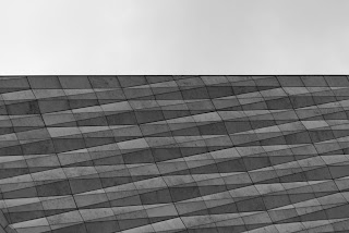
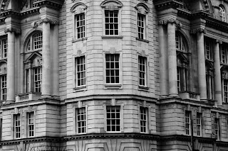
At the weekend, I went to Liverpool with the intention of taking some photos of architecture. The weather was very dull and depressing, so not ideal for this subject but I stuck with it anyway!
 
The colours came out looking very flat and grey due to the light so I desaturated them to get rid of any colour.
 
This is the Echo arena...


Lines and shapes.

 
Different viewpoints.


Details.


This is the Museum of Liverpool which is quite an interesting building.


Here are a view more shots of more modern buildings...


I also took a few images of some old buildings which I didn't enjoy as much.