Here is a series of images from my Specialist Location fashion shoot. In this post I will talk about the shoot and how it went in accordance to my plan. I will also talk about what problems I came across and how I overcame them
I managed to photograph 9 different looks which is 1 less than planned. This was because it was a very warm day and me and my model Donna were out shooting for 5 hours with no food or water! This is something I will remember in the future!
Throughout the shoot, I relied completely on natural light and a reflector. The lighting in my images changes between start and finish because we were out from around 2:00pm until 7:00pm. Therefore, in my first few looks, the sun was high in the middle of the sky, giving quite a flat, white light. As it became later, the sun lowered, giving a softer light and a warmer hue. This is the exact effect I wanted to achieve for some of my images. To ensure that I got the correct exposure in these particular light conditions, I used fast shutter speeds so that I could keep the aperture wide to create the depth of field that I think is crucial in this kind of shoot. The ISO was kept at 100 most of the time because there was lots of light, but in some shadowed areas, I changed it to 200 or 400.
I took my tripod with me but didn't end up using it because there was enough light for me to use really fast shutter speeds, making sure I didn't get any motion blur. I used shutter speeds up to 1/800sec throughout the shoot.
For each look, I took several images with different poses and different locations to give a variety and also to highlight the different items of clothing that Donna was wearing. Some images are full length, and some are zoomed in and cropped to ensure the focus is on a certain item.
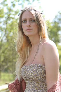
Look 1


Here is a selection of images from 'Look 1'. Some of these were taken under the shadow of the trees in the woody areas, so I would look where the light is coming through and shoot into the light, using the reflector to bounce the light back on to Donna. I came across a problem for my shoot. The assistant that I was going to use to control the reflector and to generally help speed the shoot up, couldn't make it and no one else was available to help. To overcome this, I brought a deck chair along with us to prop the reflector onto, which worked for some images, but in others I had to try and hold it in the right position myself whilst taking the picture. In future, I would make sure I had a backup assistant who could definitely come along if my original assistant wasn't able to make it.
Look 2


Throughout the shoot, I made sure that I used everything available in the location to my advantage. I used things such as trees, benches, gates and flowers as props. I also took pictures from different angles and viewpoints. I think that some of these shots could have been improved with a shallower depth of field because some of the backgrounds are quite distracting but my intention was for the viewer to be focused on the model and the clothes.
Look 3


I tried some different compositions for each look. I tried the pose above (right) with different compositions and crops. As I said before, the background is quite distracting in this one. I like the image to the left as I think I have achieved the correct depth of field and exposure.
Look 4


Look 5


For the above left image, I used the gold side of my reflector to create quite a warm hue, which I think quite suits this look, however it looks quite different to the other images so I'm not sure it fits in well with the set. I am happy with the pose and composition of the above right image, however I definitely would try to get more of a blur in the background if I was to re-shoot it. I could possibly achieve this by moving back more and then zooming in. I had to stay quite close as I was holding the reflector towards her.

By getting Donna to sit in the long grass, I could get a lovely depth of field with most of the grass out of focus and Donna in focus. I then moved to a different view point so I could get more of the yellow flowers in the background and told Donna to look in a different direction (below). I like how her hair has been highlighted at the top and you can see individual hairs. This was achieved by shooting into the direction of the light and then using the white side of my reflector to illuminate her face.


I really like the images above because of the yellow flowers and the depth of field, but I feel that they don't show the clothes off enough which is the whole purpose of the shoot. However, they could possibly be used to advertise the cardigan she is wearing.
Look 6

I took a few pictures for this look but feel I should have taken more care because when I looked back at them on the computer screen, I noticed that Donna is out of focus on a few of them, so only managed to get a couple of decent ones ,which I feel don't show off the clothes as well as I could have done because of these particular poses. To improve this, I should have zoomed in close on the camera display screen to make sure I definitely have a few good shots that I can use for each look.
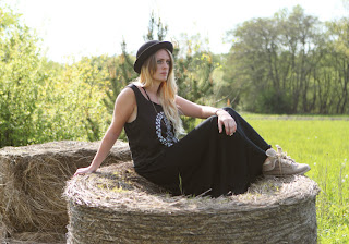
Look 7


I am quite happy with the backgrounds in both of these images as it is quite plain and blurred, ensuring that Donna is the main focus. I didn't ask Donna to smile in any of the images as I think this natural blank expression really suits the style. I think it looks quite 'cool' and goes with the edgy style of clothing. Saying this, I did want a few playful, fun shots in the set, so I would just make her laugh and snap away to make sure I captured a natural, relaxed smile and not an uncomfortable fake one.
Look 8


For this look, I moved to a shaded woody area as it is quite a flowy dress and this location was quite fairytale-like so suited quite well. With it being mostly in shade, I needed to change the ISO to 400. Also, as you might notice above, I started shooting with the daylight white balance ( above left) which I had been using all along, but then I changed it to shade, which added warmer tones which I think I prefer (above right & below). I think I could have improved earlier shots by trying the shade white balance.


Look 9


The shots for this look are my favourite because I feel that this was the best light as it was commencing at 7pm when the sun is getting lower. I love how the low sun highlights my model's hair from behind. I also really like the location and the background I chose. I have also included some playful action shots too.
With regard to editing the shots, I didn't need to do much. All I did was crop a few of them for better framing and tweak the levels in some. I also used the clone stamp tool to get rid of the reflection of my reflector in the sunglasses in some of the shots.
Overall, my shoot went well and went to plan but if I was to do the same shoot again I would have done a few things differently to improve it;
- I would prepare more items of clothing to take with me and more accessories like bags and jewellery to get a bit more of a variety.
- I would make sure that I definitely had someone available to assist me and speed up the process.
- I would try different white balances to get better tones in certain lights.
- I'd take bottles of water to keep hydrated!


+Rankin.jpg)

