For this project I chose to photograph things in my home. Objects that I see everyday. These are the little quirks that I like about my home and give it character. Little things that I would probably remember about 'Mum and Dad's house' when I'm old and grey!
When I told people what I was planning on doing for this project, they thought it was a lazy choice but I found it quite difficult! My house is quite dark and cosy so it was a challenge to get the exposure I wanted. Also, I think that 'home' is a nice subject and you HAVE to photograph it at some point for memories!
I concentrated quite a lot on composition and the use of space to create a beautiful picture. Also, I considered depth of field quite a lot too. I de-saturated some of the images a swell because I thought it gave quite a peaceful and delicate feel rather than loud and lively as I feel my home is quite a peaceful place. I used a tripod for most of these images.


.JPG)

These are on top of a wardrobe upstairs just below a velux. You can see the natural light from the window coming through. Again, i have framed it so that the object is to one side and the other side is space.
.JPG)


A walking stick on the stair case. This was quite a dark area so I had to bump up the ISO to 1600. Because of this, I began to get a little bit of noise on the background so I tweeked the noise reduction in Adobe RAW a little bit.


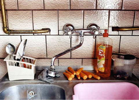
This is a little ledge at the top of a wall in my kitchen with some quite old fashioned kitchen items on it. I thought it would be interesting to photograph. I think the texture in the ceiling works well with what I was trying to achieve with the space.
In terms of composition in this image, I havn't quite stuck to the 'rule of thirds'. The objects on the shelf at the bottom take up a little bit less space than a third. I did this purposely as I think it makes the image a lot more interesting even though it is simplistic.

I tried to achieve a similar composition with this one to the one above. In my house we have lots of random objects and orniments dotted about. This is some artificial gold grapes on a gold plate (random), on a chest of drawers under our stair case. I am really happy with the way the wood has come out and the colours. I changed the white balance to cloudy as this adds warmth.
.JPG)
This is a random candle holder on the floor. I didn't move anything or stage anything during this shoot. I just moved my position and angle to get the framing i wanted and to get the composition I wanted. The majority of this image is just space on the left hand side. If i'd have take the photo so that the object was in the middle, it would have been a lot less interesting and effective.

These are on top of a wardrobe upstairs just below a velux. You can see the natural light from the window coming through. Again, i have framed it so that the object is to one side and the other side is space.
.JPG)
Originally, i took this photo with the lights on in my porch and I was quite happy with it but when i turned the lights off, i noticed the shadows of the glass door on the walls because my dad was watching TV in the other room and the light from it was flickering through onto the walls. So i stayed there with my tripod, adjusted to a slow shutter speed and took the photo again. I thought this image with the shadows was a lot better. This one reminds me of a Jessica Backhaus photograph.

I couldn't not choose this one to be included in my final 10 images. This is just one of the typical characteristics of my house. My mum likes to put quirky little figures in random places. I selected a wide aperture for this image to get that shallow depth of field. I like that the focus is just on the little guy at the front and his smile.

Using a wide aperture again to get that shallow depth of field, focusing on the candle at the front and then gradually going out of focus towards the fire in the background. I like the warmth of this image however, if i was to do it again, i would have tried to get the logs at the side of the fire in the frame and maybe try to get it a little bit brighter.

A walking stick on the stair case. This was quite a dark area so I had to bump up the ISO to 1600. Because of this, I began to get a little bit of noise on the background so I tweeked the noise reduction in Adobe RAW a little bit.

A traditional doorbell. One of the things that adds to the character of my house. This one also needed noise reduction.

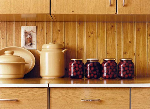
Jessica Backhaus also takes photographs around her house and others' houses and one of them is of a kitchen work top with jars etc. This is an image from my kitchen worktop. I just like the contrast of the red against the black and neutral tiles. I intended for this to be quite symmetrical and the rule of thirds comes into this image as well.
After completing my work and seeing everyone else's in the class, I wonder if maybe I could have chosen a more interesting subject matter. However, I found that it was quite a challenge to create a good image out of something quite mundane.