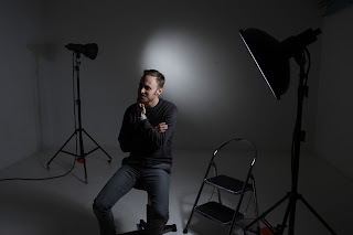
Working in a portrait studio was quite handy for this section of the brief!!
I used our studio and one of our photographers Chris as my model for the portrait part.
I did 3 different lighting set ups to demonstrate which lights create which effects.
I started with this set up below. 2 soft boxes to give a nice soft and even spread of light across Chris' face and then 2 reflectors at the back pointing towards the wall, creating that crisp white background.
Here are a few of the images i took with this light set up...
As you can see....this lighting gives a very soft and fresh look and is probably more flattering for females as it gives quite a flawless effect. All women want to look flawless!
For the next few images, I used this set up. Just 2 lights, one beauty dish to one side pointing towards Chris's face and one reflector at the back with a honeycomb. I used the beauty dish to create a focused area of light wrapping around his face and the honeycomb at the back to create a soft glow of light on the background, also focusing on a specific area and not spreading too far.
This kind of lighting is a bit more masculine as it shows the texture in Chris' face as he has just one light to one side illuminating him, creating the shadows.
You can see the effect the honeycomb had on the background. It gives quite a soft grey, with a halo of light around Chris' head.
Finally, I tried this set up just using the 2 same lights as above again, but this time turning the honey comb one towards Chris.
The beauty dish was doing the exact same and before, but the light with the honeycomb gave a little bit of light at the back of his head, highlighting some texture and the back and side of his head but still giving those nice shadows too.
I think this is the image I will choose to go with my studio brief. I prefer this lighting for my model. I like the shadows it creates and I like the way the light at the back highlights texture in his hair and back of his neck. I also like the catch lights in his eyes.


Holly tis is a excellent post. It is clear that you are very knowledgable about the effects of the modifiers and how to adjust them to achieve the desired results. You have a good range of sets ad poses, it is obvious that your model was very comfortable with with you photographing them, showing no signs of getting bored. Well done.
ReplyDelete